An interactive infographic I’ve done for illustration school some time ago. The task was to create an information-app for the iPad about organ transplantation. The intention of the app was to explain the transplantation process to potential patients. I had to do the part about skin transplantation.
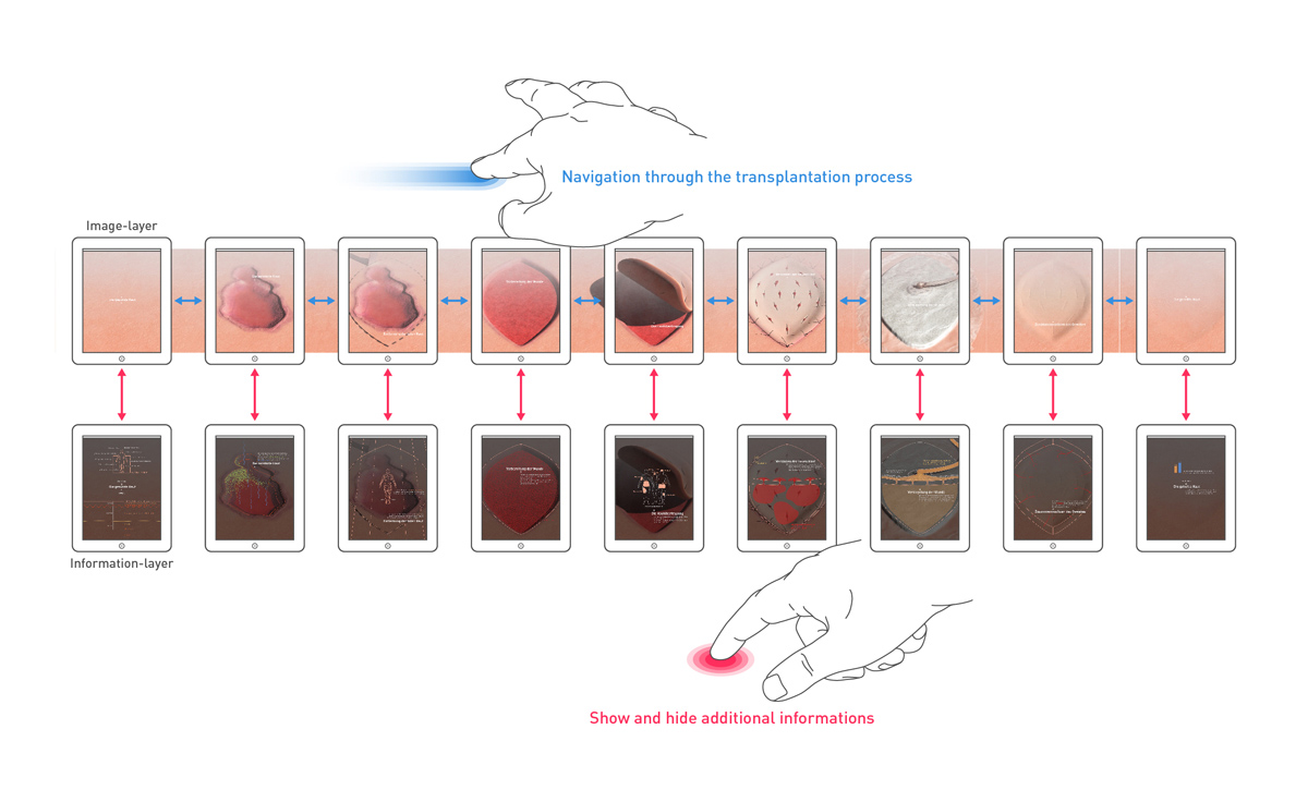
My concept is simple. It’s only one wide scrollable image. I chose this format to illustrate the skins dimension. The image is separated into several sections, each showing the skin during the transplantation process. Each section has an information layer, that explains the current process.
The overview above shows the navigation between the layers. Swiping sideways goes back and forth in the process and tapping shows or hides the information layer.
Screens 1 – 2
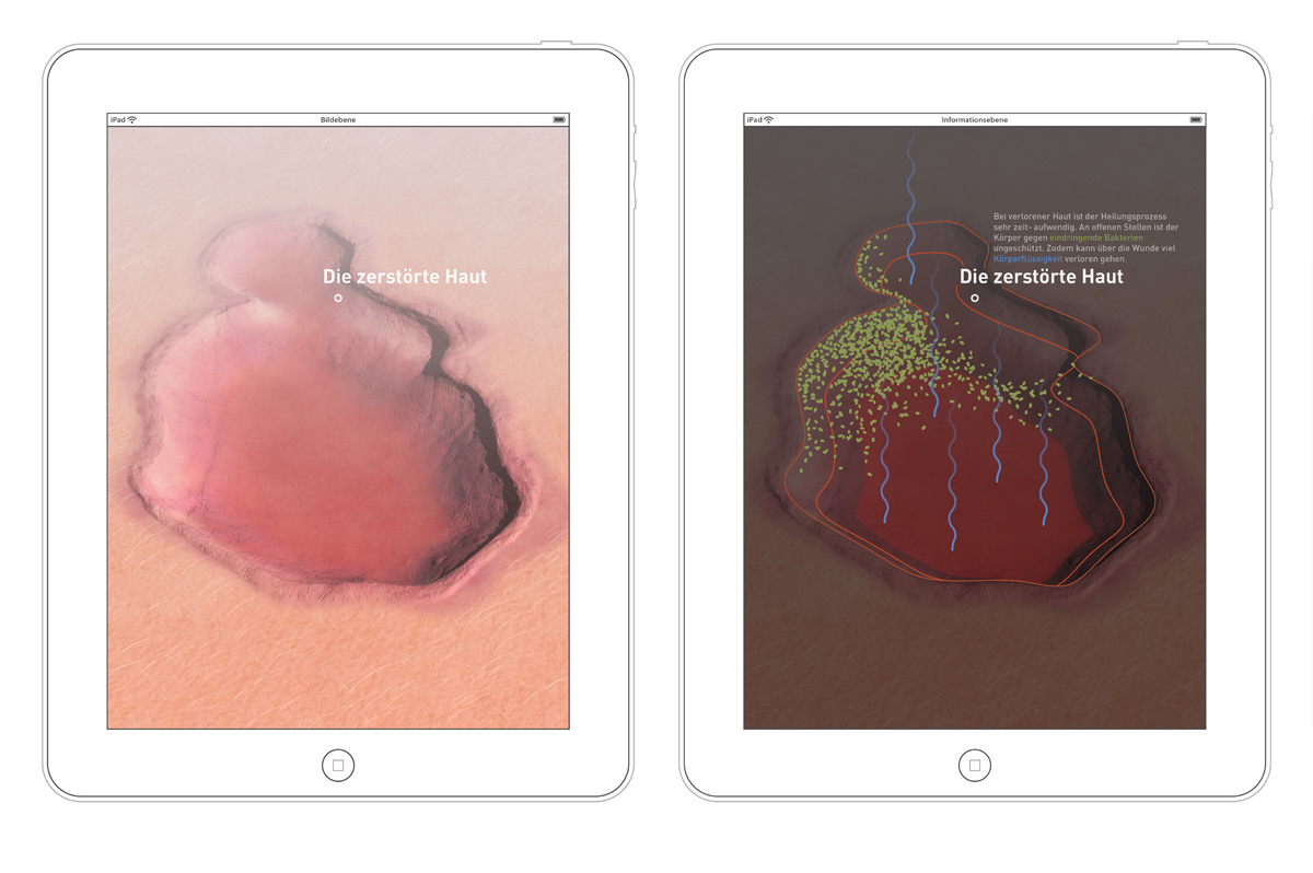
The first screens show the healthy skin, its protective function and the skin layers. The second pair shows the damaged skin and the risk of infections and fluid loss.
Screens 3 – 4
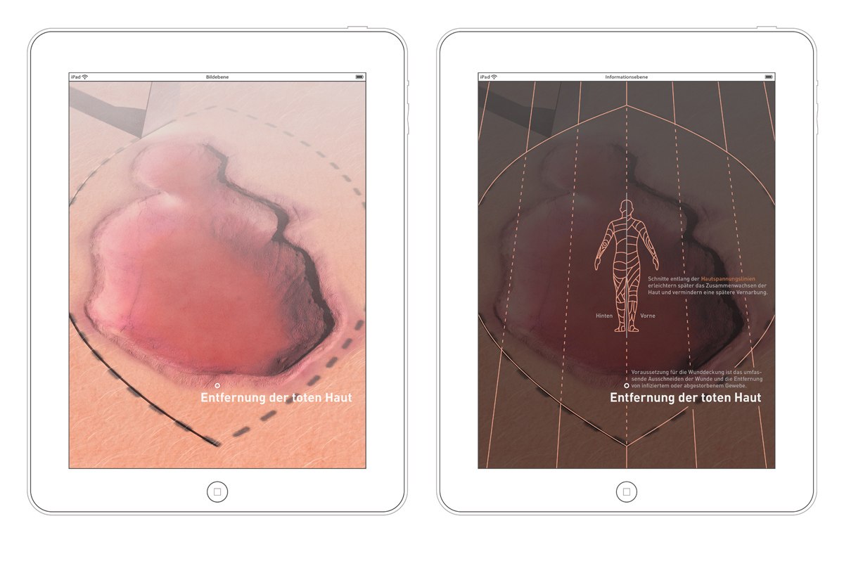
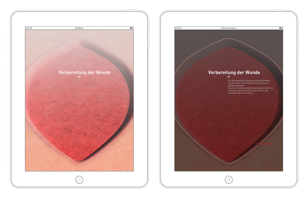
The removal of dead skin is the first step in the transplantation process. To do this, cuts are made along the direction of the skin fibers to avoid permanent scars. After this, the flesh starts to heal and builds up new layers of cells. This area with improved blood circulation is the ideal ground for a skin transplant.
Screens 5 – 6
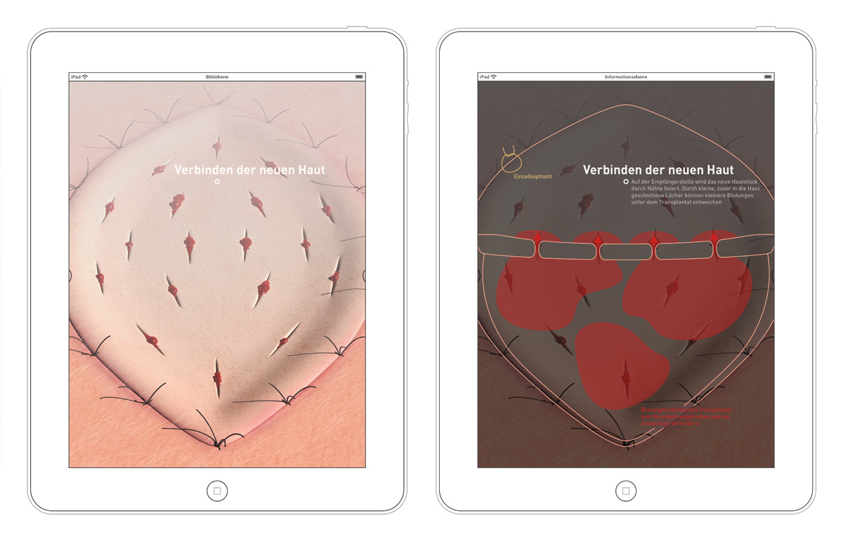
After preparation, the new skin is placed onto the wound and sewed. This skin is usually extracted from your own body. Several cuts avoid an accumulation of blood under the transplant.
Screens 7 – 8
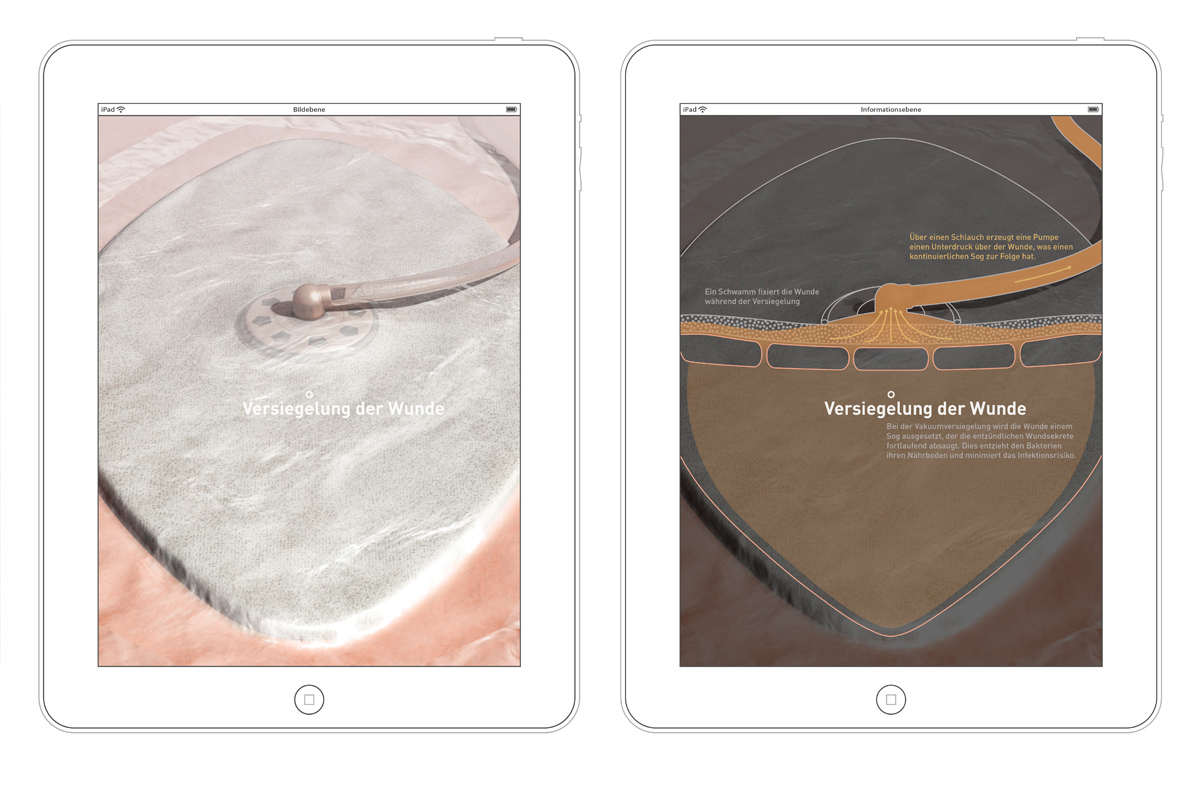
To accelerate the healing, the wound is sealed and attached to a vacuum pump. This drains off fluids from the wound and minimizes the risk of infections. If the body accepts the transplant, veins start to grow into it and the long healing process begins.
Last screen

The final screen shows the nearly healed wound. I intended to show some statistical data about skin transplantation here. I haven’t found much, except the rate for success with and without a drainage.
Early concept
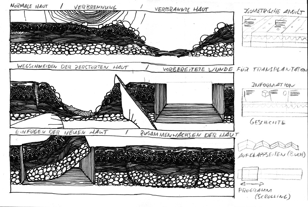
The sketch of an early concept shows an alternate perspective.


